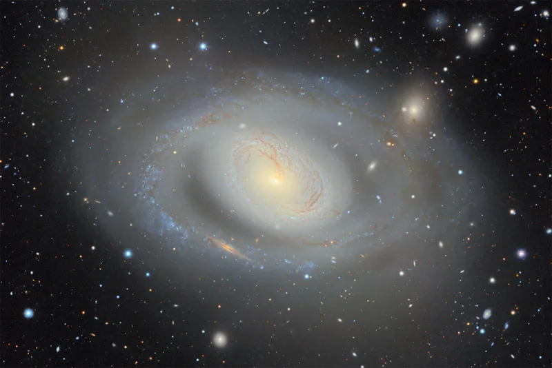
Scientists release biggest 2D map of the universe
The DESI Legacy Imaging Surveys have released a 5.6-trillion-pixel, publicly accessible 2D color map of the universe containing nearly 4 billion celestial objects, mainly stars and galaxies. The map combines 263,407 telescope exposures from three ground-based surveys, along with NASA WISE satellite and other public data, and covers about 75% of the sky in visible and near-infrared light. More than 160 scientists contributed to data collection, while a 20-person team produced the final dataset. Processing images captured across 2,285 nights took eight weeks on the Perlmutter supercomputer at Berkeley Lab’s National Energy Research Scientific Computing Center. The map provides positions and brightness measurements that let the Dark Energy Spectroscopic Instrument select targets for distance measurements and construct a 3D map of the universe. DESI began using the updated map for target selection in June 2026. DESI completed its original five-year survey in April 2026 and continues observing through 2028; early results have indicated that dark energy’s influence may be weakening over time, according to the collaboration. The data can also support searches for gravitational lenses and supernovae, comparisons with future Rubin Observatory and Nancy Grace Roman Space Telescope observations, and AI tools trained to analyze petabytes of astronomical data.
newscenter.lbl.gov
6 min
8/21/2026

AI Model Atlas – visualizing populations of ML models as interconnected 3D graph
AI Model Atlas visualizes populations of machine learning models as interconnected 3D graphs. This tool facilitates the exploration and analysis of model relationships and performance.
run.cosmograph.app
1 min
8/14/2026
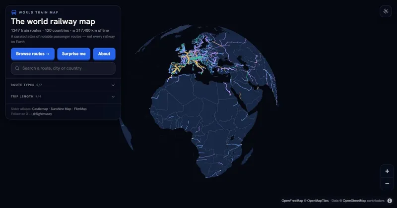
World Train Map – 1247 train routes around the world
An interactive railway map showcases 1,247 notable train routes across 120 countries, including high-speed, classic, night, scenic, heritage, and luxury lines. Each route is displayed on a fullscreen map with details such as distance, fastest journey time, and top speed.
worldtrainmap.com
6 min
8/10/2026
Hop.earth – OpenStreetMap based car racing game
Hop.Earth is an interactive platform that utilizes Copernicus DEM, IGN RGE ALTI®, and CNIG LIDAR data to allow users to explore global terrain. The service provides detailed topographical information for various applications, enhancing geographical understanding and analysis.
hop.earth
1 min
8/4/2026

Flint: A Visualization Language for the AI Era
Flint is a visualization language designed for creating interactive charts and visualizations tailored for AI applications. It aims to simplify the process of data representation, making it accessible for users without extensive programming knowledge.
microsoft.github.io
1 min
8/1/2026

What AI did to stackoverflow in a graph
AI has significantly influenced Stack Overflow, as illustrated in a graph showing changes in user engagement and question-answer dynamics over time. The data reflects a notable shift in how developers interact with the platform in response to AI advancements.
data.stackexchange.com
1 min
7/18/2026

US Job Market Visualizer
The US Job Market Visualizer on GitHub visualizes 342 occupations from the Bureau of Labor Statistics, representing 143 million jobs in the US economy. Each rectangle's area corresponds to total employment, with color coding for metrics such as projected growth outlook, median pay, education requirements, and AI exposure.
karpathy.ai
1 min
3/16/2026
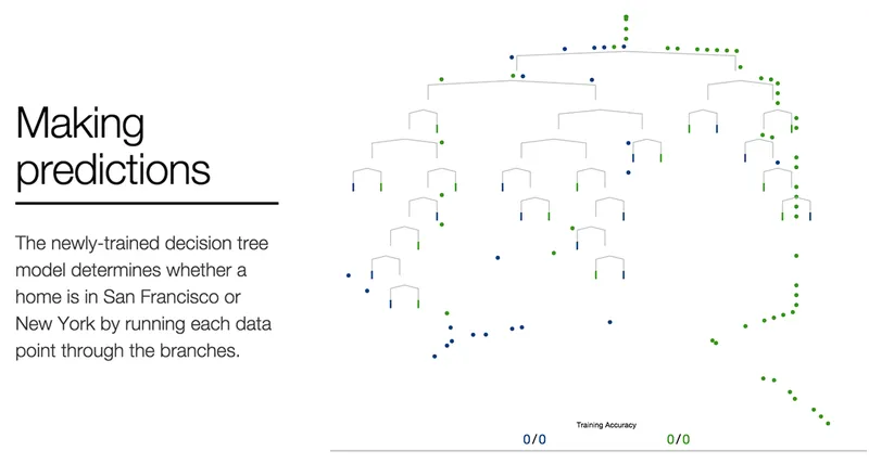
A Visual Introduction to Machine Learning (2015)
Machine learning employs statistical techniques to automatically identify patterns in data, enabling accurate predictions. A model can be created using a dataset about homes to differentiate between homes in New York and those in San Francisco.
r2d3.us
7 min
3/15/2026

Does that use a lot of energy?
A tool provides estimates of daily energy consumption for various products and activities, measured in watt-hours (Wh). It aims to clarify the differences in energy usage to help users understand the impact of different activities on overall energy consumption.
hannahritchie.github.io
16 min
3/4/2026
Scientists release biggest 2D map of the universe
The DESI Legacy Imaging Surveys have released a 5.6-trillion-pixel, publicly accessible 2D color map of the universe containing nearly 4 billion celestial objects, mainly stars and galaxies. The map combines 263,407 telescope exposures from three ground-based surveys, along with NASA WISE satellite and other public data, and covers about 75% of the sky in visible and near-infrared light. More than 160 scientists contributed to data collection, while a 20-person team produced the final dataset. Processing images captured across 2,285 nights took eight weeks on the Perlmutter supercomputer at Berkeley Lab’s National Energy Research Scientific Computing Center. The map provides positions and brightness measurements that let the Dark Energy Spectroscopic Instrument select targets for distance measurements and construct a 3D map of the universe. DESI began using the updated map for target selection in June 2026. DESI completed its original five-year survey in April 2026 and continues observing through 2028; early results have indicated that dark energy’s influence may be weakening over time, according to the collaboration. The data can also support searches for gravitational lenses and supernovae, comparisons with future Rubin Observatory and Nancy Grace Roman Space Telescope observations, and AI tools trained to analyze petabytes of astronomical data.
newscenter.lbl.gov
6 min
8/21/2026
World Train Map – 1247 train routes around the world
An interactive railway map showcases 1,247 notable train routes across 120 countries, including high-speed, classic, night, scenic, heritage, and luxury lines. Each route is displayed on a fullscreen map with details such as distance, fastest journey time, and top speed.
worldtrainmap.com
6 min
8/10/2026
Flint: A Visualization Language for the AI Era
Flint is a visualization language designed for creating interactive charts and visualizations tailored for AI applications. It aims to simplify the process of data representation, making it accessible for users without extensive programming knowledge.
microsoft.github.io
1 min
8/1/2026
US Job Market Visualizer
The US Job Market Visualizer on GitHub visualizes 342 occupations from the Bureau of Labor Statistics, representing 143 million jobs in the US economy. Each rectangle's area corresponds to total employment, with color coding for metrics such as projected growth outlook, median pay, education requirements, and AI exposure.
karpathy.ai
1 min
3/16/2026
Does that use a lot of energy?
A tool provides estimates of daily energy consumption for various products and activities, measured in watt-hours (Wh). It aims to clarify the differences in energy usage to help users understand the impact of different activities on overall energy consumption.
hannahritchie.github.io
16 min
3/4/2026
AI Model Atlas – visualizing populations of ML models as interconnected 3D graph
AI Model Atlas visualizes populations of machine learning models as interconnected 3D graphs. This tool facilitates the exploration and analysis of model relationships and performance.
run.cosmograph.app
1 min
8/14/2026
Hop.earth – OpenStreetMap based car racing game
Hop.Earth is an interactive platform that utilizes Copernicus DEM, IGN RGE ALTI®, and CNIG LIDAR data to allow users to explore global terrain. The service provides detailed topographical information for various applications, enhancing geographical understanding and analysis.
hop.earth
1 min
8/4/2026
What AI did to stackoverflow in a graph
AI has significantly influenced Stack Overflow, as illustrated in a graph showing changes in user engagement and question-answer dynamics over time. The data reflects a notable shift in how developers interact with the platform in response to AI advancements.
data.stackexchange.com
1 min
7/18/2026
A Visual Introduction to Machine Learning (2015)
Machine learning employs statistical techniques to automatically identify patterns in data, enabling accurate predictions. A model can be created using a dataset about homes to differentiate between homes in New York and those in San Francisco.
r2d3.us
7 min
3/15/2026
Scientists release biggest 2D map of the universe
The DESI Legacy Imaging Surveys have released a 5.6-trillion-pixel, publicly accessible 2D color map of the universe containing nearly 4 billion celestial objects, mainly stars and galaxies. The map combines 263,407 telescope exposures from three ground-based surveys, along with NASA WISE satellite and other public data, and covers about 75% of the sky in visible and near-infrared light. More than 160 scientists contributed to data collection, while a 20-person team produced the final dataset. Processing images captured across 2,285 nights took eight weeks on the Perlmutter supercomputer at Berkeley Lab’s National Energy Research Scientific Computing Center. The map provides positions and brightness measurements that let the Dark Energy Spectroscopic Instrument select targets for distance measurements and construct a 3D map of the universe. DESI began using the updated map for target selection in June 2026. DESI completed its original five-year survey in April 2026 and continues observing through 2028; early results have indicated that dark energy’s influence may be weakening over time, according to the collaboration. The data can also support searches for gravitational lenses and supernovae, comparisons with future Rubin Observatory and Nancy Grace Roman Space Telescope observations, and AI tools trained to analyze petabytes of astronomical data.
newscenter.lbl.gov
6 min
8/21/2026
Hop.earth – OpenStreetMap based car racing game
Hop.Earth is an interactive platform that utilizes Copernicus DEM, IGN RGE ALTI®, and CNIG LIDAR data to allow users to explore global terrain. The service provides detailed topographical information for various applications, enhancing geographical understanding and analysis.
hop.earth
1 min
8/4/2026
US Job Market Visualizer
The US Job Market Visualizer on GitHub visualizes 342 occupations from the Bureau of Labor Statistics, representing 143 million jobs in the US economy. Each rectangle's area corresponds to total employment, with color coding for metrics such as projected growth outlook, median pay, education requirements, and AI exposure.
karpathy.ai
1 min
3/16/2026
AI Model Atlas – visualizing populations of ML models as interconnected 3D graph
AI Model Atlas visualizes populations of machine learning models as interconnected 3D graphs. This tool facilitates the exploration and analysis of model relationships and performance.
run.cosmograph.app
1 min
8/14/2026
Flint: A Visualization Language for the AI Era
Flint is a visualization language designed for creating interactive charts and visualizations tailored for AI applications. It aims to simplify the process of data representation, making it accessible for users without extensive programming knowledge.
microsoft.github.io
1 min
8/1/2026
A Visual Introduction to Machine Learning (2015)
Machine learning employs statistical techniques to automatically identify patterns in data, enabling accurate predictions. A model can be created using a dataset about homes to differentiate between homes in New York and those in San Francisco.
r2d3.us
7 min
3/15/2026
World Train Map – 1247 train routes around the world
An interactive railway map showcases 1,247 notable train routes across 120 countries, including high-speed, classic, night, scenic, heritage, and luxury lines. Each route is displayed on a fullscreen map with details such as distance, fastest journey time, and top speed.
worldtrainmap.com
6 min
8/10/2026
What AI did to stackoverflow in a graph
AI has significantly influenced Stack Overflow, as illustrated in a graph showing changes in user engagement and question-answer dynamics over time. The data reflects a notable shift in how developers interact with the platform in response to AI advancements.
data.stackexchange.com
1 min
7/18/2026
Does that use a lot of energy?
A tool provides estimates of daily energy consumption for various products and activities, measured in watt-hours (Wh). It aims to clarify the differences in energy usage to help users understand the impact of different activities on overall energy consumption.
hannahritchie.github.io
16 min
3/4/2026
No more articles to load