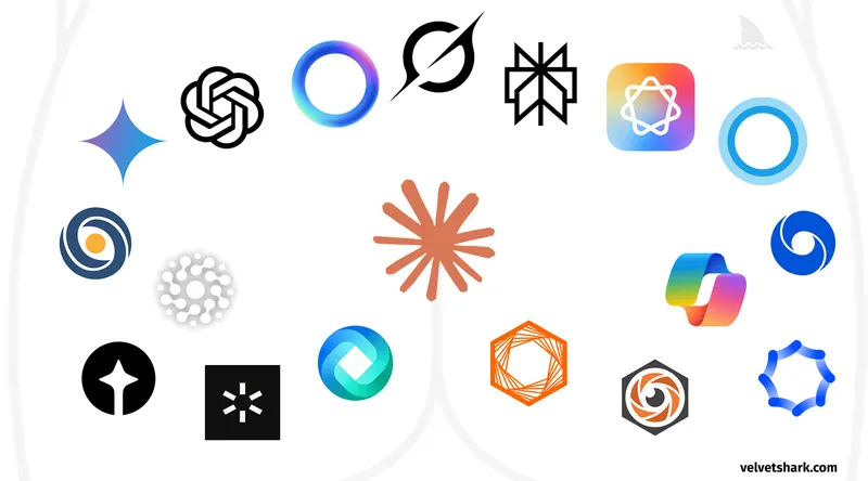
Why do AI company logos look like buttholes?
velvetshark.com
July 18, 2026
7 min read
🔥🔥🔥🔥🔥
66/100
Summary
Many AI company logos feature a circular shape with a central opening, radiating elements, and soft curves. This design trend has led to comparisons between these logos and the appearance of buttholes.
Key Takeaways
- Many AI company logos feature circular shapes with gradients, central openings, and radiating elements, leading to a visual resemblance to buttholes.
- OpenAI's logo evolved from a simple text-based design to a circular logo with a central void, which the company claims symbolizes the intersection of humanity and technology.
- The trend of circular logos in the AI industry is attributed to design psychology, unintentional biomimicry, and a copycat effect among companies.
- The percentage of AI company logos resembling buttholes is significantly higher than in other industries, despite some traditional companies also adopting similar designs.
Community Sentiment
Concerns
- Commenters are questioning the accuracy of AI-generated descriptions, highlighting a disconnect between the logo's design and the claims of precision and structure.
- The absence of color in logos is seen as a glaring mistake, suggesting that AI might not grasp design nuances effectively.
- Some users are drawing unflattering comparisons between AI logos and inappropriate imagery, indicating a lack of aesthetic appeal.